Living Room Wallpaper Ideas: 12 Looks That Interior Designers Actually Recommend
The living room is the hardest room to get right — and the one where wallpaper makes the most dramatic difference. Here are 12 ideas worth stealing, from dark feature walls to full-room botanical immersion.
The living room is the room that does the most work. It receives guests, absorbs daily life, and is typically the space you look at most — including from the sofa, which means you're looking at the walls for extended periods in a way you rarely are in a kitchen or hallway. Getting the wallpaper right here matters more than anywhere else in the house.
The good news: the living room is also the most forgiving room to experiment in. The scale forgives bold choices. The furniture provides enough visual ballast that even a dramatic paper lands rather than overwhelms. Here are twelve ideas that consistently deliver.
Before you shop: three questions to answer first
Choosing a living room wallpaper before answering these will lead you to the wrong paper, regardless of how beautiful it looks on screen.
- 1.One wall or four? A single feature wall (almost always the wall behind the sofa) is lower commitment and works with any pattern. Four walls demands a quieter design — something tonal, textural, or with enough breathing room that it reads as an environment rather than a busy repeat.
- 2.How much natural light does the room get? South- and west-facing rooms can carry dark papers comfortably. North-facing rooms benefit from warm undertones in any colour, including dark ones — avoid anything with a cool or blue-grey cast.
- 3.Peel-and-stick or paste? If you rent, or if you're not ready to commit, today's premium removable papers are genuinely indistinguishable from traditional paste papers at normal viewing distances.
Pro tip: Order a physical sample before committing. Screens show colours under lab-calibrated light; your living room doesn't. A paper that looks warm and rich on screen can read greenish or flat in a north-facing room. Most brands charge £3–8 for a sample — it's the single best investment in a wallpaper project.
12 living room wallpaper ideas
1. The dark feature wall
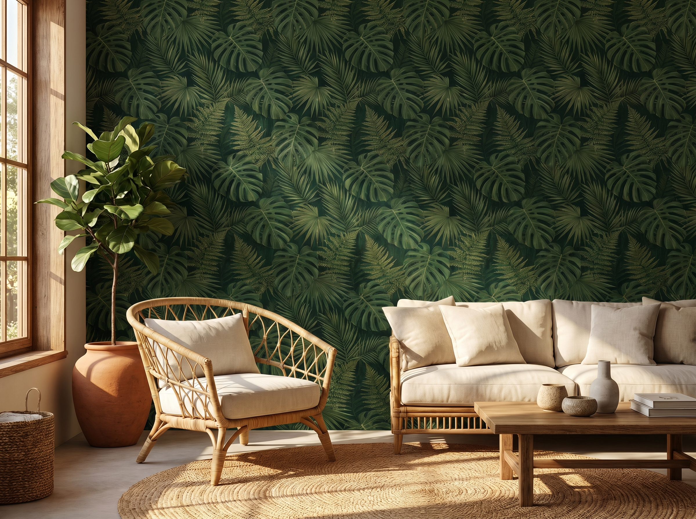
The wall behind the sofa is the living room's natural feature wall: most visitors face it, it grounds the seating arrangement, and it's where a dramatic paper makes the strongest impression. Deep backgrounds — forest green, midnight navy, near-black charcoal — absorb light rather than reflect it, creating warmth and intimacy that pale walls simply cannot achieve.
Choose a design with some complexity: a dark botanical, a dense geometric, or an abstract with tonal depth. A single colour flat-painted wall in a dark tone creates drama; a dark patterned wall creates drama with something to reward sustained attention.
2. All-four-walls botanical
The conventional approach is one wallpapered wall, three painted. The braver — and often better — result is four botanical walls. The key is choosing a design with enough tonal variation that it reads as an enveloping environment rather than a busy repeating pattern. Pale-background botanicals with open compositions work in almost any room. Dense, dark-background botanicals are best in rooms with good light or controlled artificial lighting.
Done well, a full-room botanical hang transforms a living room into something that feels genuinely distinctive — a room that could not be anyone else's. Rebel Walls' Verdant Canopy is the benchmark for this effect: the scale is confident enough to hold four walls without feeling claustrophobic.
3. Geometric accent wall
A bold geometric — hexagons, large-scale diamonds, overlapping circles — on a single wall creates a graphic statement that anchors a room without overwhelming it. The best geometric papers have depth: metallic accents, subtle embossed texture, or a pattern that shifts in apparent tone depending on the viewing angle and light direction.
Pair with solid-colour upholstery in one of the paper's secondary colours. Let the pattern have air around it — a geometric feature wall fighting with patterned cushions and a busy rug is the most common mistake in living room design.
4. Chinoiserie
Chinoiserie — the European interpretation of Chinese decorative arts, featuring pagodas, exotic birds, cherry blossoms, and fantastical landscapes — is one of the few wallpaper styles that is genuinely timeless. It appeared in English country houses in the 1750s and remains correct today. Living rooms with high ceilings and traditional architectural details are its natural home. In contemporary spaces, a single chinoiserie wall behind a low-profile modern sofa creates a dialogue between eras that is more interesting than either alone.
5. Textured grasscloth
Grasscloth is the wallpaper equivalent of a natural-fibre rug: tactile, warm, and so clearly a material that it makes everything around it look better. The texture reads differently in different light conditions — flat and muted in overcast daylight, warm and dimensional under evening lamps — which gives a room with grasscloth walls a quality that changes throughout the day.
Use it as a neutral backdrop in a room full of collected objects, art, and layered textiles. It has the rare quality of receding completely when you're looking at everything else in the room, while adding unmistakeable warmth and sophistication to the overall effect.
6. Oversized vintage floral
Large-scale vintage florals — roses the size of fists, peonies trailing from floor to ceiling — are experiencing a sustained revival after years of minimal interiors. The key word is large-scale: small repeating florals create visual noise and make rooms feel busier; an oversized, confidently drawn floral gives the eye a clear subject and reads as almost maximalist-minimal.
In living rooms, vintage florals work best on the chimney breast wall, framed by flat colour on either side. Choose a paper where the background tone relates to the room's existing colour — a warm cream background unifies; a stark white background isolates.
7. The panelling effect
Several brands now produce wallpaper that mimics decorative wall panelling — dado rails, raised rectangular panels, picture rails — without any joinery. Applied to all four walls, it creates a Georgian or Arts & Crafts atmosphere at a fraction of the cost of real woodwork. Applied below a picture rail, it gives a Victorian-style two-thirds panelled treatment with painted plaster above.
Choose a colourway with enough contrast between the panel tone and the background for the illusion to read convincingly. Dark-on-dark (charcoal panel, near-black background) creates a dramatic library effect. Cream-on-white is quiet and architectural.
8. Full-wall tropical mural
A single full-wall tropical mural — a banana plantation, a magnolia garden, a bird-of-paradise thicket — turns the wall into a destination. The furniture becomes secondary; the mural is the event. Both Rebel Walls and Chasing Paper produce full-wall murals at genuinely impressive print quality, sized to your exact wall dimensions and arriving as numbered panels that assemble in sequence.
The instinct is to worry that a mural will date quickly. In practice, the opposite tends to happen: a room built around a strong, singular graphic statement becomes more coherent over time than one assembled from multiple competing patterns.
9. Art Deco geometry
Art Deco wallpaper — fans, sunburst rays, stylised chevrons in gold, black, and deep jewel tones — pairs with the living room's other interwar classics: leather Chesterfields, lacquered side tables, aged brass hardware. The geometry tends to be more complex and layered than contemporary geometric designs, with multiple overlapping motifs and metallic accents that catch light from multiple directions.
Treat the pattern as a backdrop rather than a feature: choose a lighter or more neutral tone on three walls and the stronger colourway on the chimney breast or feature wall behind the sofa.
10. Moody stripe
A vertical stripe in a deep colour — navy, bottle green, charcoal — is the most reliable trick for making a living room feel taller. The eye follows the stripe upward and the ceiling appears higher as a result. The depth of colour adds warmth without busy-ness.
Use it on all four walls for a library or gentlemen's club atmosphere, or on the chimney breast alone as a more restrained application. Match the deepest stripe tone exactly to the skirting board colour — this grounds the stripe and makes the wall treatment feel complete rather than applied.
11. Abstract painterly
Loose watercolour washes, gestural brushstroke prints, and abstract botanical interpretations share one quality: they suggest art without being art. They give a room the feel of a gallery wall without requiring you to curate one. These papers tend to read as more relaxed than botanical or geometric alternatives, making them better suited to rooms you use constantly and informally than to formal entertaining spaces.
Look for papers where the abstraction is genuinely loose — not a rigidly repeating pattern of brushstrokes, but something where the repeat is difficult to detect and the overall effect reads as organic and hand-made.
12. The committed peel-and-stick transformation
For renters, or anyone not ready to commit: a full-wall peel-and-stick installation behind the sofa is now a genuinely viable living room statement. The best brands (Chasing Paper, Tempaper, Hygge & West) produce designs that are indistinguishable from paste papers in photographs and at normal viewing distances — and they remove cleanly without paint damage when you move or change your mind.
The inhibition most people have about peel-and-stick in a living room is aesthetic, not practical. Overcome it with a sample. Hang it against the wall and live with it for 48 hours. The decision usually makes itself.
Shop living room wallpaper
Browse our curated edit of living room wallpapers — from bold feature wall statements to subtle all-room textures.
Explore living room designs →How to choose the right wallpaper for your living room
Scale: match the room, not the sample
Patterns always look larger on a sample than on a wall. A repeat that feels bold on a 30cm swatch can look appropriately scaled in a room with 2.7m ceilings. The reverse is also true: a design that looks subtle on a small sample can become overwhelming when multiplied across 16 square metres of wall. Order the largest sample you can get — A4 minimum, A3 preferred — and pin it to the actual wall before ordering.
Colour: read it in situ, not on screen
Monitor calibration, screen brightness, and ambient lighting all affect how a colour reads on screen. A deep forest green can appear almost black on one screen and vivid lime-adjacent on another. The only reliable way to choose a living room wallpaper colour is to view a physical sample on the actual wall at different times of day: morning light, afternoon light, and evening with your usual lamps on.
Commitment: honest assessment of how long you'll stay
Paste-the-wall paper on a prepared wall lasts 15–20 years and takes significant effort to remove. If you're likely to move within five years, peel-and-stick is often the more rational choice regardless of quality concerns — you're not paying a premium for longevity you won't use. If you're in a long-term home, paste gives a better substrate, longer adhesion, and access to heavier, more luxurious paper grades.
Coverage: feature wall or full room?
A living room feature wall typically uses 3–5 rolls and takes a half-day to hang. A full four-wall hang uses 14–17 rolls and is a full day's work for a professional decorator, or a weekend for an experienced DIY hanger. The cost difference is significant. The impact difference is even more significant — but in both directions. A wrong choice at full-room scale is a bigger problem than a wrong choice on a single wall.
Three things to avoid in living rooms
- 1.Small-scale repeating patterns on light backgrounds across all four walls. They create visual noise rather than pattern — the eye cannot settle and the room feels restless. Save small repeats for one wall or for rooms with strong architectural detail that provides visual anchoring.
- 2.Matching patterned wallpaper with patterned upholstery in the same colourway. The instinct is to coordinate; the result is usually competition. Let one dominate — either the wallpaper or the textiles — and let the other be a foil.
- 3.A feature wall in an unexpected location. The wall behind the sofa and the chimney breast are the conventional choices for a reason: they are the natural focal points of the room. Wallpapering a side wall or the wall the sofa faces outward into will look considered only if everything else in the room is very deliberately arranged — which is rare in a working living room.
Frequently asked questions
Sofia Laurent
Sofia is a Paris-based interiors writer and contributing editor at Murall Journal. She covers trend, design culture, and the spaces that shape us.
Continue reading
2 October 2026 · 8 min read
Wallpaper for Dark Rooms: What Actually Works (and What Makes It Worse)
2 October 2026 · 9 min read
Wallpaper Trends 2026: The 10 Directions Defining Interiors Right Now
2 October 2026 · 9 min read
How Much Does Wallpaper Cost? A Room-by-Room Price Guide for 2026
Never miss a story