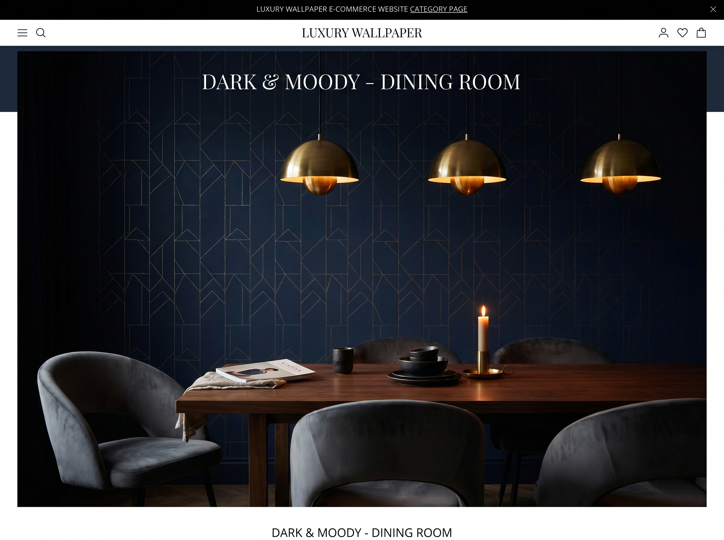
Dining Room Wallpaper Ideas: 10 Looks That Make Every Meal Feel Like an Occasion
The dining room is the strongest argument for bold wallpaper in the house. You sit in it, at close range, for an hour at a time, under lamplight. Here are ten directions that reward exactly that kind of sustained, intimate attention.
The dining room makes the strongest argument for bold wallpaper of any room in the house. Consider the conditions: you sit still in it for an hour at a time, at close range to the walls, under warm lamplight rather than the flat overhead light that flattens colour and texture in other rooms. The food is a sensory experience that primes attention. The conversation creates pauses where the eye moves around the room. There is no better context in which to hang a paper that rewards looking.
Interior designers have understood this for centuries — the dining room is historically where the boldest, most expensive papers went. The tradition is correct. The dining room is where wallpaper makes the most difference, where it is most noticed, and where a wrong choice is most felt. Get it right here and it is one of the best design decisions you will make in your home.
What makes the dining room different
Three qualities set the dining room apart from every other room when it comes to wallpaper.
The first is lamplight. Dining rooms are almost always used under warm, directional lamp or candlelight rather than overhead illumination. This completely changes how colour reads: warm light enriches warm tones (amber, terracotta, forest green, burgundy) and makes cool tones (pale blue, grey, cold white) recede. A paper that looks beautiful under showroom daylight can look flat and dead at a dining table lit by a single pendant. Always view your sample under the actual lighting you will use.
The second is close-range viewing time. An hour at the dinner table means sustained, close-range attention to the walls — the kind you simply do not give a living room wall when you are watching television or moving through a hallway. Patterns with genuine complexity and visual depth reward this. Patterns with an easily-read repeat or a flat print become boring quickly.
The third is theatre. More than any other room, the dining room is a stage — for meals, for guests, for the rituals of eating together. Wallpaper contributes directly to that theatrical quality. A dark, richly patterned room that makes everyone at the table look their best is not an accident; it is a design decision made in the understanding of what a dining room is for.
10 dining room wallpaper ideas
1. Dark botanical — the restaurant effect
Dark-background botanical wallpaper is the design decision that more than any other reproduces the atmosphere of the best restaurant interiors in a domestic dining room. The reasons are the same in both contexts: the dark background absorbs ambient light and focuses attention on the table and the people around it; the botanical complexity rewards the pauses in conversation; the warmth of green-on-dark is flattering to both food and faces under lamplight.
On all four walls, a dark botanical in a dining room is transformative. It turns a functional room into a destination — a room that guests talk about and return to. The scale of a full dining room hang is exactly right for a dense, complex paper that would feel oppressive in a smaller or more casually used space.
"The dining room is the one room where I always push clients toward four walls. A feature wall in a dining room is a compromise. Four walls is the statement."
2. Full chinoiserie
Chinoiserie — the traditional fantasy of pagodas, exotic birds, and trailing branches in a continuous panoramic landscape — was designed for the dining room. The English country houses that defined its use in the 18th century hung it in dining rooms specifically because the panoramic quality (the design continues around the room telling a landscape story) was best appreciated by seated guests with time to look.
In 2026, chinoiserie is available across the full tonal range from pale traditional to dark contemporary. The classic pale blue-on-cream colourway works in rooms with formal furniture and period detailing. Deep jade-on-black or gilt-on-charcoal versions work in contemporary dining rooms where the traditional version would feel period-specific. Both approaches are correct — the pattern structure is the same; the register changes everything.
3. Maximalist floral at scale
A large-scale vintage floral — roses at near life-size, peonies trailing ceiling to floor — in a dining room reads as confident maximalism rather than domestic fussiness. The scale matters: a small repeating floral in a dining room is busy and slightly anxious. An oversized, boldly drawn floral gives the eye a clear subject and holds attention across the length of a meal without becoming noise. Pair with plain linen in one of the floral's background tones and with simple table settings that let the room do the work.
4. Art Deco gold and black
Art Deco wallpaper — sunburst fans, stylised chevrons, overlapping geometric forms in gold, black, and deep jewel tones — is one of the strongest dining room choices for the simple reason that it was designed for exactly this context. The Deco era produced its most extraordinary wallpapers for dining rooms, ballrooms, and hotel restaurants: spaces where theatre and ceremony mattered, where surfaces were seen by candlelight, and where gold caught flame.
A metallic Deco paper on all four walls of a dining room, lit by a statement pendant and candles on the table, is one of the most dramatic domestic interiors achievable. It is not subtle. It is correct.
5. Deep jewel tones — the library effect
A tonal, densely patterned paper in a deep jewel colour — burgundy, sapphire, deep plum, hunter green — creates what decorators call the library effect: an enclosed, warm, intellectually rich atmosphere that makes a room feel private and complete. The effect is heightened in a dining room because the enclosed quality suits the intimacy of shared meals. Deep jewel-toned dining rooms are also extraordinarily flattering — warm coloured walls under warm lamplight make everyone at the table look better than they do in any other light.
6. Tropical mural
A full-wall tropical mural on the wall behind the head of the table — banana palms, bird-of-paradise, a jungle canopy — turns the dining room into an immersive environment. The head-of-table wall is the natural focal point of any dining room (the view from every other seat), and a mural there creates a composition: the table as object, the mural as backdrop, the whole room as a scene.
Single-wall mural application works better in dining rooms than in most other rooms because the dining table provides a strong horizontal foreground element that grounds the vertical scale of the mural. Without furniture, a full-wall mural can feel unanchored; in a dining room, the table gives it a base.
7. Toile de Jouy
Red-on-cream toile in a dining room is a French tradition so established that it constitutes its own interior design language — evoking country houses, Sunday lunches, provincial restaurants, the agrarian world that food comes from. The narrative quality of toile (pastoral scenes, classical figures, harvest and feast imagery) is as appropriate to a dining room as any motif available.
The contemporary update is colourway: black-on-white toile reads as graphic and modern. Olive-on-cream reads as restrained and botanical-adjacent. Deep blue-on-pale reads as coastal and cool. The pattern structure is unchanged; the colour choice relocates it entirely.
8. Textured grasscloth in a warm neutral
Not every dining room wants theatre. A calm dining room — one used daily for family meals as much as for entertaining — often works better with a warm textured neutral than with a statement paper. Grasscloth in warm hemp, amber, rust, or warm stone provides the tactile warmth and lamplight depth of a richly decorated room without the visual intensity of a bold pattern. It recedes when you are focused on the table and company, which is exactly what the best backdrop does.
9. Geometric on the chimney breast
In a dining room with a chimney breast, the breast wall is the natural focal point and the obvious position for a feature paper. A bold geometric — particularly one with metallic accents or a complex layered structure that catches lamplight from multiple directions — on the chimney breast alone, with plain walls on either side, creates a composed room with a clear hierarchy. The geometric anchors the fireplace without overwhelming the intimacy of the space.
10. Abstract painterly for a contemporary dining room
A loose, gestural abstract wallpaper on all four walls of a contemporary dining room — particularly one without a fireplace or other strong architectural feature — creates atmosphere without iconography. The eye moves across the surface finding colour, movement, and depth rather than a resolved pattern. Under warm lamplight, the best abstract papers take on a quality that feels almost painted — shifting slightly between courses as candles move, giving the room a living quality that no flat surface can achieve.
How to choose for a dining room specifically
View the sample under dining light, not daylight
This is the most important single instruction for dining room wallpaper. Pin your sample to the dining room wall and look at it specifically under the pendant, wall lights, or candles you will actually use. A colour that looks perfect in morning daylight may completely change under a warm 2700K pendant. Dark papers often look better under lamp than in daylight — they absorb the cooler tones of natural light and warm dramatically under incandescent or warm LED sources.
Scale the pattern to the table, not just the room
In a dining room, the wallpaper is viewed from a seated position at the table. This changes the effective viewing distance: the walls feel closer than they do when standing. A pattern that looks appropriately scaled when you are standing in an empty room may feel overwhelming when you are seated at a table placed two metres from the wall. The correction is to sit in a dining chair during your sample viewing rather than standing at the centre of the room.
Four walls almost always beats one
The dining room is the room where the four-walls approach most consistently produces a better result than the feature wall approach. The reason is the theatre argument above: a dining room that is fully enclosed in a strong paper creates an environment. A dining room with one papered wall and three painted walls creates a room with a feature. The first is a destination; the second is a decorated room. In spaces where the objective is atmosphere — and the dining room is the room where atmosphere is most the point — the full treatment is nearly always correct.
Shop dining room wallpaper
Browse designs curated for the dining room — from dark botanicals to theatrical Art Deco, all rated for the lamplight test.
Explore dining room designs →Frequently asked questions
Sofia Laurent
Sofia is a Paris-based interiors writer and contributing editor at Murall Journal. She covers trend, design culture, and the spaces that shape us.
Continue reading
2 October 2026 · 8 min read
Wallpaper for Dark Rooms: What Actually Works (and What Makes It Worse)
2 October 2026 · 9 min read
How Much Does Wallpaper Cost? A Room-by-Room Price Guide for 2026
12 May 2026 · 10 min read
How many rolls do I need? The definitive wallpaper calculator guide
Never miss a story